.png)
.png)
The Upgrade dashboard was functional but had opportunities to improve clarity and user engagement. The redesign focuses on creating a more intuitive and visually structured experience, making key financial details more accessible while guiding new customers through essential actions.
The old dashboard had all the important details, but finding what mattered most wasn’t always easy. New users didn’t have much guidance on where to start, and key actions weren’t as intuitive as they could be. The challenge was to make the experience more structured, user-friendly, and visually engaging—without adding clutter.


.png)
Onboarding completion increased by 34%, supporting a smoother start for new users. Task discovery grew by 2.3 times, enhancing visibility of important actions. First 30 days engagement rose by 24%, indicating greater user interaction within the first month.
34% 📈
2.3× ⬆️
24% ⬆️
The process began by analyzing the existing dashboard to identify areas for improvement. The main challenges included lack of hierarchy, missing onboarding guidance, and a need for a more intuitive experience.
As part of the dashboard redesign, we wanted to ensure consistency across multiple products such as the Rewards Checking Account, Upgrade Card, and other offerings. These products have different features and user flows, but it was essential that they felt cohesive within the overall user experience.
To achieve this, we worked closely with product teams to align on design principles, ensuring that key elements like navigation, data presentation, and interactions were consistent across all components.
.png)

Added cues to simplify navigation and improve task completion
Organized layout to focus on essentials for a smoother experience
Used familiar patterns for quick user understanding and increased task completion.
.png)
I collaborated with the Product Manager to map out all possible account states and designed tailored UI for each. Every state required relevant banners to provide clear context and guidance, so I created designs that ensured users received the right information and actions at the right time.
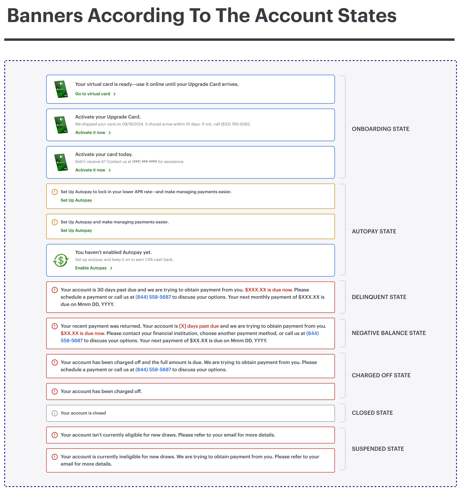
To ensure the dashboard was clear and actionable, I mapped out all possible account scenarios and designed relevant banners for each state. I collaborated with the product managers, marketing team, and legal compliance team to gather feedback, ensuring the messaging was accurate, helpful, and aligned with business goals.
.png)
.png)
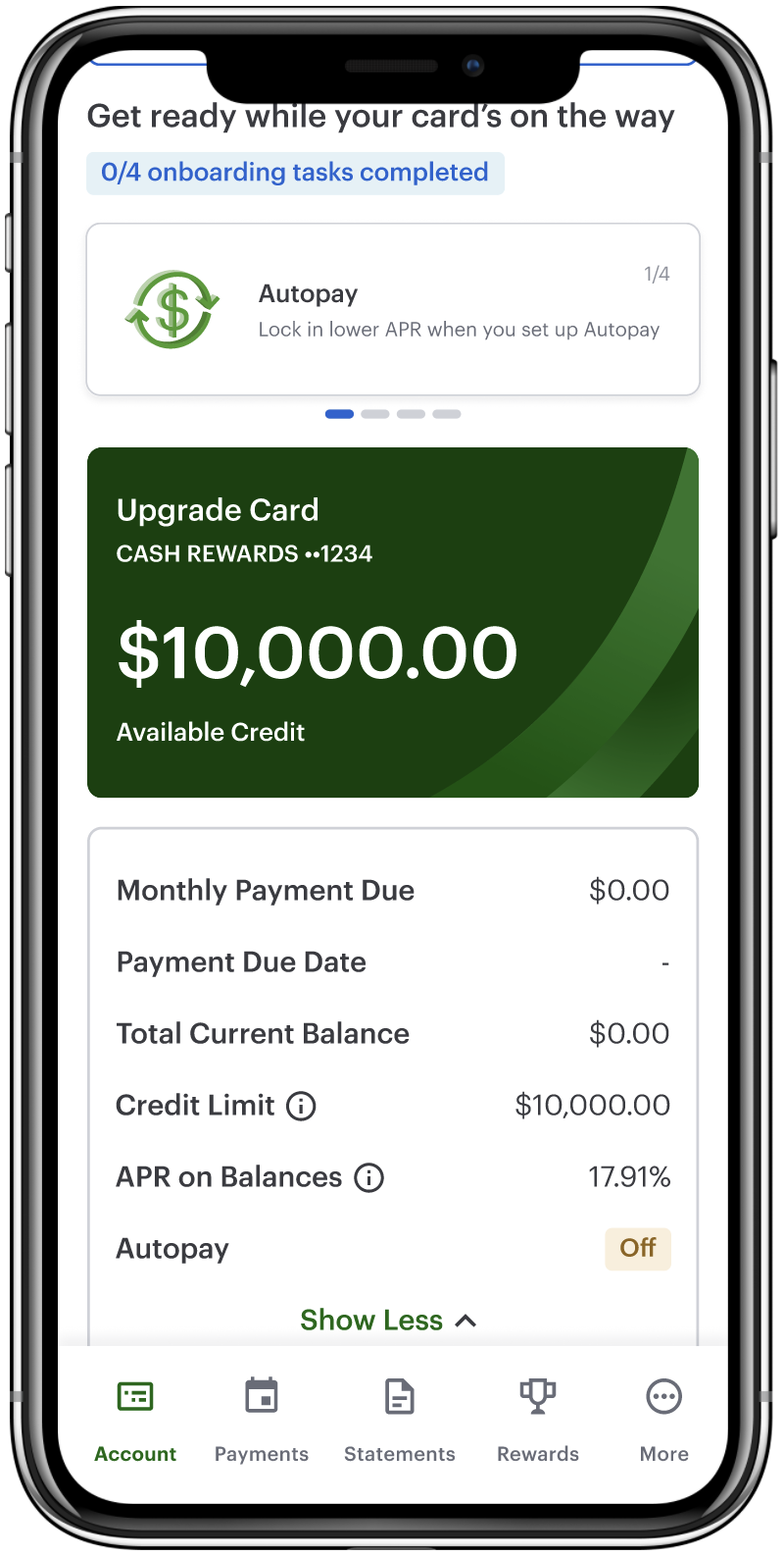
To create a smooth and guided onboarding experience, I designed a dedicated section that helps users complete key setup actions effortlessly. I worked closely with product managers and stakeholders to refine the flow, making sure it was both intuitive and aligned with user needs.
.png)


This redesign successfully improved user clarity and ease of use. By mapping account states and introducing guided onboarding, we significantly enhanced key metrics. Onboarding completion increased by 34%, task discovery grew 2.3×, and overall engagement rose by 24%. 🚀
These results highlight the impact of focused design improvements on user experience. I’m excited to continue refining the product based on these insights. 💡

